Monday, March 15, 2010

An Interview with Joel Spector

Joel Spector, a Way Art illustrator has what it takes.
Yes! An awesome likeness and he nails it every time.

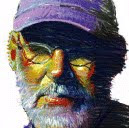
Known for his images of elegance, Joel Spector was born in Havana, Cuba, came to the United States at the age of twelve, and currently lives in New Milford, CT with his wife, Rowena and four children, Max, Ari, Jacob and Saskia. He graduated from Fashion Institute of Technology and attended the Art Student’s League. Joel started out in the field of fashion illustration then moved on to general illustration and has been working on well-known accounts throughout the years. His work has been published in books, children’s books, magazines, newspapers, advertising and annual reports.
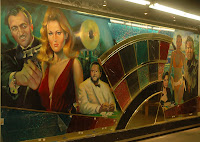
Honors include Gold Medal awards from the Pastel Society of America, Society of Illustrators award, and Best in Show at the Kent Art Association. His work has been featured in Artist’s Magazine, Pastels International, Best of Pastels, and various international magazines. Japanese television produced a documentary showing his vibrant and methodical illu
stration process. Presently working on murals in addition to illustration, Joel is sought out to paint commissioned portraits and his work has been included in many prominent collections. He has taught a FIT, Wooster Community Center for the Arts and is currently at Western Connecticut State University.

Way Art: In your opinion, what’s the hardest thing about drawing a likeness? What’s the easiest?

Joel Spector:
The portrait painter John Singer Sargent once described a portrait as “a painting where the mouth is never quite right”. The concept of “likeness” is interpretive. There is nothing easy about achieving a likeness, some artists have the ability to capture the spirit of a person and some cannot.


WA: What if you have to draw a celebrity from a certain angle and you can’t find reference.
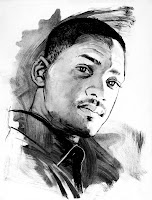
JS: I can usually do my own research through movies or
concerts they’ve made. I can find certain angles and even if the quality is not quite ideal and it’s usually enough for me to make it work.
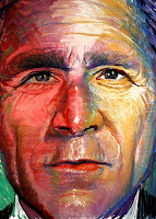


WA: What do you do when the reference is not good?

JS: The ideal solution is to photograph the subject myself. In the past I’ve received from client’s poor quality reference when nothing else was available and so I relied on my abilities as best I could to capture the essence of that person.


Do you trace or use the computer?

JS: Once I have the proper photo reference I project the image in order to speed up the process. I only use the computer once I scan in my art, in order to tighten up some of the details.

Which mediums do you work in?

JS: Professionally I work with pastels. With pastels I can create a loose feeling or I can make it look like a very finished oil painting. I prefer to use pastels because I can work much faster and I don’t have to wait for layers to dry. I can move through a painting quickly. For comps, storyboards and animatics I might use markers and go over the art with pastels.


WA: Can you tell us in detail, step by step the process you go through to get from reference to finish?


JS: The process usually begins with the client to discuss their needs. Once I understand the clients aim if it’s someone I can photograph myself I will do that so I can light it in order to get the proper effect. If I’m unable to photograph it myself I will have to rely on reference given to me by the client or I will have to do my own research. Once I have the proper reference I do a series of rough thumbnail sketches from which the client will pick the one he likes best and then do a tighter pencil. Once that is approved I will go on to finish art.

WA: Tell us about your experience teaching college students?


JS: I’ve been teaching for about eleven years and it’s always stimulating. As a freelance illustrator I often work in isolation so teaching allows me to interact and verbalize my thoughts.

WA: How has this benefited you as an illustrator?


JS: Young people, though their talents have not been developed bring into the classroom freshness and a unique way of looking at things that a more experienced artist may not have thought of. I feel I learn from my students sometimes as much as I teach them.

WA: What was one of your funniest moments on a job?

JS: Once I was lent an Alfa Romeo for a month while doing an ad for them. In the middle of the project my wife went into labor with our twin sons. I drove her to the hospital in the Alfa and it provided a very smooth and fast ride even though I worried all the way that her water might break but we made it.


Tuesday, December 8, 2009

A Way Art Interview with David Case

David Case is a freelance illustrator, storyboard artist, and screenwriter. Born in Hartford, Connecticut David has been drawing since age 2, growing up on a steady diet of comic books and movies, leading him to win both the theatre and art prizes at the Loomis Chaffee School in Windsor, Connecticut. After graduating with a B.A. in film from Vassar College in Poughkeepsie, New York, David moved to Taos, New Mexico where he taught skiing. David moved to New York soon after and began his illustration career as an apprentice to Denis Luzuriaga in 1995. His interests include cooking, photography, cycling, traveling and fitness. David is currently illustrating his first graphic novel, writing his second screenplay, and living in Los Angeles.

Way Art: Your style has changed greatly over the last several years. Can you tell what prompted you to make such a change and how your style evolved?

DC: Well, when I first started in this business, I noticed that the majority of artists, while extremely talented, were also a bit dated -- their characters looked like the were stuck in the 60’s and 70’s in terms of clothing and hairstyles. My decision as an artist has always been to change with the times, and to keep the art looking as fresh and contemporary as possible. I think my style is sort of the organic result of follwing trends and getting to know my computer better.


Your style is so realistic, can you explain your process?

DC: I’m a digital painter and photographer. Once I’ve gone over the job with the

A.D., and thumbnailed the board, I’ll then create mockups or collages in lieu of a traditional pencil. This involves shooting friends or models and/or pulling swipe off the internet. Although this part of the process is labor intensive, making revisions is a breeze -- it’s easy to patch a head or change shorts into pants -- and going to FINISH takes a fraction of the time it took when I was a traditional artist using pencils, inking with brushes and coloring with markers. Once I’ve assembled the frame, the fun begins -- I toggle between painter and photoshop
using a variety of tools to create the final illustrated piece. Since I began this process I travel everywhere with my camera, taking pictures of everything from coffee cups to park benches.


There is a great deal of photography incorporated in your work. If the hero is a celebrity, how do you maintain the character likeness in each frame with so many angles and movement?

DC: Well, I live in LA so I just hang out by the Ivy! One of the reasons I want to marry Google, there are tons of images of celebrities out there. I love it when the clients provide swipe. I can still draw the celeb traditionally too.

With such a realistic style, what has been the biggest challenge for you so far? What has been your greatest success?


DC: Well people love the overall look of my art...now. When I first went digital in ’99 some clients and A.D.’s were a little freaked out becuase my style was so startlingly different. One of my first digital jobs, the A.D. hated it, I mean, really hated it. But I stuck with it. I think seeing photo realistic backgrounds took some getting used to, but now it seems pretty common. Plus, I‘ve gotten way better at it. Some A.D.s prefer a loose drawing style, and sometimes I wish I was doing that quick sketchy stuff -- realism poses some unique challenges, and frankly I never have as much time on the image as I would like. But I never miss a deadline! I’m glad I chose this unique process, It keeps me interested. And the animatics I work on look better than ever. I’m always getting calls, so I guess I’m doing something right.

Can you tell us one of your funniest moments working on a job or using a model?

DC: Well, my neighbor Marie was willing to do a comic pratfall for a StayFree animatic. She had to pretend to crash into a table at an outdoor cafe. I laid out a few blankets and a comforter and she was my stuntwoman. She went for it, diving and flailing about. What a trooper! I have great neighbors!
What is your process when working with clients? Can you walk us through an animatic job?

DC: Well, first up is the conference call with the creatives, the producers, the buyers and the team’s spiritual advisor. We’ll go through the script frame by
frame and make sure we’re all on the same page. After the call, I’ll mostly likely head to the nearest bar and start drinking. Then the research phase begins, surfing the net for images, dropping them into a folder, and snapping as much photo reference as possible. Then I’ll begin assembling the mock-ups. OnceI’m really in there, working away, the amount of heads, lips, and arms needed for the animatic becomes much clearer. A lot of the color issues I’m resolving as I layout the frames. Once I’m greenlit to finish, It’s a matter of painting, doing linework and labeling the layers so it’s easy for the animators to do their work.

What do you love most about doing animatics?

DC: I love animatics because they’re really fun to do. I get a kick out of seeing a few static images come to life, and I have lots of fun using my friends as models. They’re great to work with, and always willing to help me out. Unlike storyboards which might be due in a day or two, I’m typically given plenty of time to work on an animatic. The clients benefit from the relaxed schedule by getting my best possible work.


Wednesday, November 18, 2009

Interview with Way Art's Kevin Kobasic

"Everybody Loves Kevin" is something we find ourselves saying alot here at Way Art.

Kevin Kobasic grew up around the advertising business. His father, John Kobasic, worked as an account executive at Doyle Dane Bernbach and Cole & Weber, before founding Kobasic Hadley in Seattle, WA. “When I was a kid I didn’t really understand that my dad had a cool job,” he says. “I think I assumed that everyone’s fathers used them as extras in TV commercials.”

Kevin studied painting for a year at a fine arts college, but soon quit school to take a job at Marvel Comics. He spent several years as a penciler drawing action-oriented comics such as Deathlock and The Punisher. He later moved into the animation field, designing and storyboarding for cartoon shows such as Courage The Cowardly Dog, Codename: Kids Next Door and Wordworld. Eventually Kevin set his sights on a career in advertising, and brings his colorful experience to bear on a style that is highly adaptable yet uniquely his own. Constantly developing and refining his technique, Kevin has carved out a high-energy style at once dynamic and whimsical. He lives in New York City with his wife Faith and their daughters Edie and Roxy.


In your opinion what makes a killer storyboard and why do you think it is so crucial when an agency is trying to sell a concept?

Kevin Kobasic:
Energy! Our little corner of the business is all about selling an idea. I’m not just there to help communicate the idea, I’m there to help make a client fall in love with it. So many of the technical aspects of drawing have been overtaken by technology, but drawings can communicate an ineffable sense of energy, of humor, of life. A drawing can charm the eye and fire the imagination like nothing else. That’s the X factor that allows a creative’s idea to come to life in the mind of a client.


Your work is not super tight compared to some styles out there. Why do you think your work is so appealing in comparison?

KK: I figured out early in my career that I was never going to be that guy who does super tight airbrushy stuff. I tried to do what I thought advertising boards were supposed to look like, but it wasn’t working. I had started life as a comic book artist who idolized Frank Miller, so my instinct is to go bold and dynamic. An AD friend of mine encouraged me to play to my strengths, and then it started to click. Oddly, I’m starting to get more photo-realistic lately, but had to take the long way around to it. I find that some people do prefer a looser, more impressionist approach, so that the client pays attention to the core idea and doesn’t get hung
up on details. That’s the niche I try to fill. Plus, as I said, that feeling of energy and spontaneity counts for a lot. I have one client who literally hangs over my shoulder and seizes on the initial spontaneous line, and won’t let me alter it.

“Everybody loves Kevin” is something we often find ourselves saying here at Way Art. Why do you think clients fall in love with working with you?

KK: Who said what, now?

How do you cut corners when you have a crazy deadline. Please share a real example.

KK:
It usually comes down to just sweating a lot, gutting it out and forcing myself to work more intuitively. I love working in a business that demands so much be done on the fly, because you learn to push yourself beyond what you’re comfortable with. I also do the frames in assembly-line fashion, as if I were attaching the same widget to each piece that comes down the conveyor belt. There’s a frame on www.wayart.com of two people walking to Outback Steakhouse. I tend to be a perfectionist and tweak the details a lot, but I targeted that frame as a good one to make up some time. I was somewhat horrified to find it on the website because I drew it so quickly, but looking at it now I have to admit it works.


What motivates you to constantly improve and evolve your style? Technology changes? Other artists influence?

KK:
At a tender age I asked my father, who owned an agency for 20 years, what qualities the best creatives tended to have in common. He thought for a second and said, “an insatiable curiosity about how the work could be improved”. That made a big impression on me. He may as well have carved that quote onto a stone tablet. Years later I asked him how I could go about breaking into storyboarding, and he said, “Storyboarding? I don’t think anyone does that anymore”. Oh well, they can’t all be jewels!

What was your all time best gig?

KK:
I did some storyboards for an animated Pepperidge Farm campaign that wound up with me designing a brand mascot and acting as the illustrator for TV and print. It was one of those things where nobody had a clear idea of what the character should be, and they were looking at a lot of more-experienced illustrators. I had to pump out hundreds of character designs in an effort to find something that everyone could hang their hat on.
It was wonderful to be the key artist and feel like the character was “mine”. It
made me extremely invested in the work. It also meant some very long hours
since I was the go-to guy on almost everything. When we were producing the animatics that sold the business I remember pulling a 72 hour shift. It also taught me how the tiniest detail could make or break a concept. We went through
endless rounds of revisions trying to get the arch
of an eyebrow right to properly sell a joke.

Tell us about your animation and character development experience.

KK: The quality control in animation was a huge learning curve for me. In comics you can draw Spider-Man a hundred different ways, but in animation you have to know exactly how thick each eyelash on a character is. I fell into the business, so I didn’t have the benefit of a three-year animation school. I had two weeks to learn it on the fly or get out. As a designer you’re an extra hand to a showrunner who’s too busy to draw the whole show himself. So you have to be able to get into his head and design in virtually any style on demand. You work in a pressure cooker with very talented people and can solicit a lot of feedback and criticism. Ideally you’re trying to produce something that makes everybody in the room erupt in laughter. To amuse ourselves in the studio we used to do really brutal caricatures of each other. The game was to try to hit the other guy back harder than he hit you. It sometimes escalated into psychological bullying and hurt feelings, believe it or not. But you develop an ability to grab a funny idea out if the ether and immortalize it in a few seconds.


What are some of the things you do to get "a firm idea" of what the client is after?

KK: Some people have to be coaxed a little. I pay attention to those little pauses that say, “I’m not happy with this one but I don’t want to seem high-maintenance”. I always figure, if the work comes out good it’s better for both of us. My most high-maintenance clients are also the ones who force me to improve. Any time I get to go on-site and work cheek to jowl with an AD good things are going to come out of it. There’s a creative synergy that happens when you’re in the same room. I can get an instantaneous read on their reaction to something I’m drawing. It cuts down communication time.

What was your funniest or most embarrassing moment on a job?

KK: They mostly involve getting busted trying to pirate wifi, or getting thrown out of stores and restaurants for taking reference pictures. Not long ago I was asked to storyboard a music video for Wyclef Jean from the Fugees. I was also asked to sit in on the concept meeting and do some preliminary character sketches of the man himself. Wyclef had no idea who I was or why I was there, but he was too polite to say anything as I sat across the table staring holes into him. When he found out what I had been doing he was relieved that I hadn’t been trying to hit on him. He was very gracious and complimentary of my work, even telling me that if he could draw like me he’d be getting tons of girls. I thought that was funny, as if he’d trade the life of a rock star for the life of a dorky cartoonist.

Based on your experience getting started what advice would you give someone interested in a career in storyboard art?

KK: Storyboarding? I don’t think anyone does that anymore.


Wednesday, October 14, 2009

An Interview with Bruce Rauffenbart

Way Art's Bruce Rauffenbart,
He's A Real Pro!
Bruce grew up around illustration. His father Thomas Rauffenbart was a successful illustrator in Philadelphia. At the Philadelphia College of Art, Bruce studied painting and earned a BFA. He received an MFA from the Tyler School of Art in Rome, Italy. He also studied at the Provincetown Workshop for 2 summers. After returning from Rome, Bruce had a successful one-man show at the Gross McCleaf Gallery in Philadelphia. Bruce moved to New York City from Philadelphia when he began to receive agency calls asking him to work on important campaigns. Since then he has worked with the top talent in the ad industry. He lives and works in Tribeca with his wife, graphic designer Suzanne Ketchoyian, and their 2 children.

Why do you think a solid foundation in drawing is so important to every aspect of visual arts?

Bruce Rauffenbart: Most creative ideas begin with a thumbnail sketch. Often the challenge is in retaining the essence and strength of what was in the first thumbnail sketch to the final art.

People may think that since so much work is being done digitally through photo comping etc. that the drawing is secondary. What is your take on this subject?
BR: It is a different approach than working up from a thumbnail sketch, but a sense of composition, perspective and depth of field are still important in photo-comping, as well as retouching skills to make it all hold together. I often do a rough photo-comp that I then draw from. When doing people I find a drawing has more life than a heavily retouched photo-comp. With storyboards, continuity is important both in terms of the subject and the style. On occasions when I use photos for backgrounds I try to make them look like art.

What do you love most about your job?

BR: Every job is different. Some are like solving a puzzle. I like working with art directors and that is why I am with Way Art because they encourage communication between artist and art director.

Why do you think your solid drawing skills are an asset when working from a script or written description instead of a layout?

BR: A written description can be interpreted visually in different ways. Sometimes I like the freedom to interpret the script and develop interesting camera angles but the AD’s intentions are what is important. I can put rough sketches together quickly in order to nail down the AD’s intent.

When do you draw from your head and when do you use reference or models?


BR: Usually a job combines both methods. I don’t have a formula for when I do either. Shooting my own reference is best. Sometimes I like the distortion in the photos other times I find a drawing works better if I just look at the reference and draw from it rather than trace.

Growing up with an accomplished illustrator for a father must have been very inspiring. How did this experience help shape your career?

BR: As a kid, I loved going to my dad’s studio in Philadelphia and to lunch at the Philadelphia Sketch Club where illustrators and art directors would meet, eat and tell stories in the Rathskeller and then play pool upstairs. Sometimes I would model for my dad while he snapped Polaroids (the kid pleading to Santa…that’s me). We always had the Illustrator Annuals in our house and we occasionally came to New York City to see the Illustrator Annual shows. It was thrilling to see original art for movie posters, ads and national magazine spreads.


How did you transition from being a painter to illustrating for advertising?

BR: The transition wasn’t easy because I was going from being an abstract painter to an illustrator using markers. I took over my dad’s studio after he died and worked on my portfolio for several months. At night I went to Fleisher, a free art school in south Philadelphia to draw the figure. I started looking for sketch work and it took almost a year to make a living as an illustrator.


Your coloring is rich, graphic and sometimes moody which is very striking. Describe how you achieve this.

BR: My painting background has definitely helped my color sensibility. I often think of the color as an enveloping light that creates a mood. Photoshop gives the artist an unlimited range of color & saturation possible.
It is very liberating.


How do you continue to perfect your drawing skills?

BR: I go to Spring Studio or Atelier on Union Square to draw and paint from live models. There are many different approaches to drawing. I give myself the freedom to try them out. I also go to a lot of museum shows and crawl the Chelsea Galleries once a month. Artists need to have a visual curiosity and be challenged by the new and unfamiliar.

How has the computer changed your art?

BR: It has actually loosened me up. In addition to coloring, I can draw with a pencil, which I prefer, rather than the pens we used with markers. I can try out different approaches on the same piece by creating new files, the use of layers and the blessing of forgiveness, command Z.

Tell us about your experience working on site in advertising agencies and why your ability to draw makes you good at this.

BR: It usually means working without a lot of the resources we are used to. So drawing out of my head is what I usually need to rely on. It is also good to be face to face with art directors.

Your work always looks great no matter how tight the deadline is. How are you able to pull it off?

BR: Thank you. Experience has taught me to make fewer false moves. I just put my head down and get to work. Every job deserves my best effort.

Monday, September 28, 2009

DORON BEN-AMI

HOW DOES HE DO IT? ACHIEVE SUCH INCREDIBLE BEAUTY AND REALISM IN SUCH A SHORT PERIOD OF TIME?
Doron Ben-Ami, a WAY ART comp storyboard and animatic illustrator, will answer our questions and show how he does it using live models.

Can you tell us a little about your process of creating a storyboard or animatic using live models?

Doron Ben-Ami:
1. I shoot the model with as many of the necessary elements as possible .i.e. hair, clothing, etc.

2. I keep the lighting soft and neutral unless the frame specifically calls for dramatic light.
This is to minimize the complexity of the art.
Frames can be realistic, but need to maintain a strong graphic quality. Simplicity is key.

3. I import the image into photoshop, separate out the character into it’s own layer.


4. I separate head, shirt, pants, hands, shoes, and give them each their own layer.

5. I create a new layer for outlines.

6. I create selections for each of the component shapes, border them by one pixel, and fill those bordered selections with black, beginning the outline layer.

7. I draw in the rest of the outlines using a Wacom tablet and stylus set at 3 pixels wide, black, paintbrush, pressure-sensitive. This is where most of the “art” is actually done.

8. I go back to the object layers: shirt, head, etc., and apply heavy Median filter. This gets rid of details, but leaves color. All the detail now rests in the outline layer.

In your opinion, what's the best thing about using live models? What's the worst thing?

DB: Best thing: real, natural, believable people. Worst thing: need to watch out for becoming a “slave” to the reference. It’s easy to get too influenced by it, and forget to create.


Can you tell us one of your secrets to using live models to create your artwork?

DB:
Inspire the model by unabashedly assuming the pose you’re looking for. If you’re willing to look foolish, they’ll give you more of themselves.


What are some of the complications of using live models?

DB: There are none. Using live models makes my work easier.

What are some of the challenges in matching the model with the hero character for a board?
DB:
Finding available friends or family, or budgeting for a pro through an agency. Or… doing the extra drawing and thinking necessary to change the model’s appearance.

What are some of the characteristics you look for in a model?

DB:
A ham, a willingness to be outrageously expressive. The more acting they give me, the less work I have to do later.

What was one of your funniest moments using a model?
DB:
Often, I use myself. I had to do one frame of a man giving a woman Mouth-to-mouth resuscitation. For this, I posed with my wife, on the floor and with my 15-year old son behind the camera. We all had the uncomfortable experience of my son shooting me Mouth-to-mouth, open mouthed, with my wife. (Hey! pipe down, Nothing wrong with that!) Anyway, it was awkward, and the three of us were laughing so hard, that it took about twenty minutes to get this otherwise very simple shot. I kept trying to get annoyed, but I was laughing too hard.


Carefree:15:"Roadtrip"

Thursday, August 13, 2009

Check out Scott McBee, A Way Art comp, storyboard and animatic illustrator who is so versatile.

Scott started drawing around the age of 5. Growing up in the country side of Northern California, he had 3 horses, 5 cats, 3 dogs and 9 guinea pigs. His early subjects were of all the pets he had around the house. Throughout his schooling he always gravitated toward any kind of art class that was offered and excelled.
Scott graduated from San Diego State University majoring in graphic design and illustration. In 1989 he moved to NYC and landed an internship at Ogilvy and Mather Advertising. This is where he found his focus, comp, storyboard and animatic illustration. Working in the O&M sketch studio became like graduate school for him learning from amazingly talented artist such as Harry North, Basil Gogos and Marie Mutz.
In addition to advertising Scott is also an accomplished children's book and editorial Illustrator, working with Hyprion Publishing, Scholastic, and Innovative Kids. In November of this year Scott will have his paintings exhibited in his first one man show sponsored by the Chinese Porcelain Company in New York.

What changes in the illustration industry have you seen in the last 10 - 15 years? What are some recent trends? How has that affected you and/or your work?

SM: I thing the biggest change in the industry was the required adaptation by the artist to learn to use a computer and be able to scan and transmit their images digitally to the AD. If you didn’t adapt I think an illustrator would find a hard time finding work. The other big change was one of much tighter deadlines; everything is needed end of day or first thing tomorrow morning. This above all else has made it a necessity to work much faster and a lot looser to meet those tighter deadlines. Although the job always gets done and the AD is happy, I feel the quality of the work has suffered. It’s like being trained as a chef for a fine restaurant but because of the deadlines you feel more like a short order cook in a fast food joint. Another trend I’ve over the last 7-8 years is for illustrators to be able help out the AD to art direct the storyboards. I’m finding that it’s a definite plus is you can “visually read” a script.

Your images have an edge to them, but also an intense beauty in their color and texture. How much of your work is happening on the computer and how much by hand these days?

SM: All of my line work is still drawn by hand. I don’t think a computer will ever trump a human’s hand. Nearly all of my coloring is now done digitally. At first, I was very resistant to using a computer for my coloring but once I got the hang of it, I really started to enjoy.


How did you get started in art?


SM:I’ve always been drawing or painting since the age of 5. When I moved to NYC, I landed an internship at Ogilvy & Mather. I considered it my finishing school. Everything I learned was from pro’s who had been in the business before I was born. I was like a sponge.


In an average life span of an illustrator's career, how many years can they get work with a particular style?

SM:I like to review, freshen up my portfolio, website every 5 years. I think it’s also important to review your work with your rep, if you have one, because they are the first in line to find out what an AD is looking for.

How do you continue to be inspired in your art, from where do you draw inspiration?

SM:When I have down time I use that time to paint, sculpt or work on different projects such as a children’s book. Cinematography inspires me the most. I love to just sit and watch the camera move and try to memorize those new angles and incorporate them into my story boarding.


Do you have special interests that you feel passionate about and if so, why?

SM:I love to travel because life is very short. Want to see as much of this world and have fun doing it while I can. I like to go to places that have a rich sense of history, where things happened. In June I’m going to Pompeii.

How has your versatility become your strength?

SM:Most if all I think it allow me to be confident in knowing that I can handle whatever is thrown at me. I’m not locked into one certain style. I’ve learned to be able to adapt to whatever the AD needs. I think if I didn’t have my versatility I would me a nervous wreck, always wondering if I can do the job. Versatility is definitely a big plus for me.